
React 19+
Client component support for the copied TSX file.
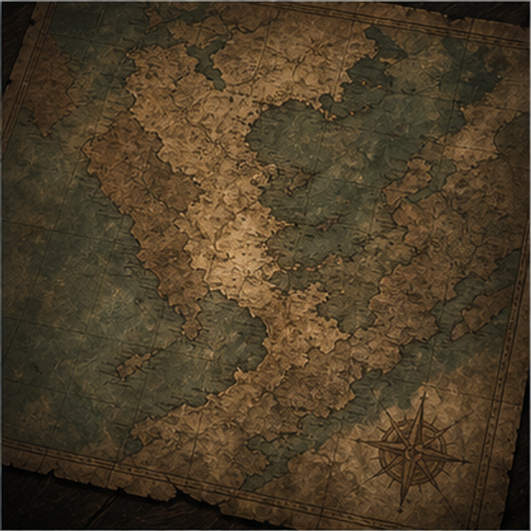
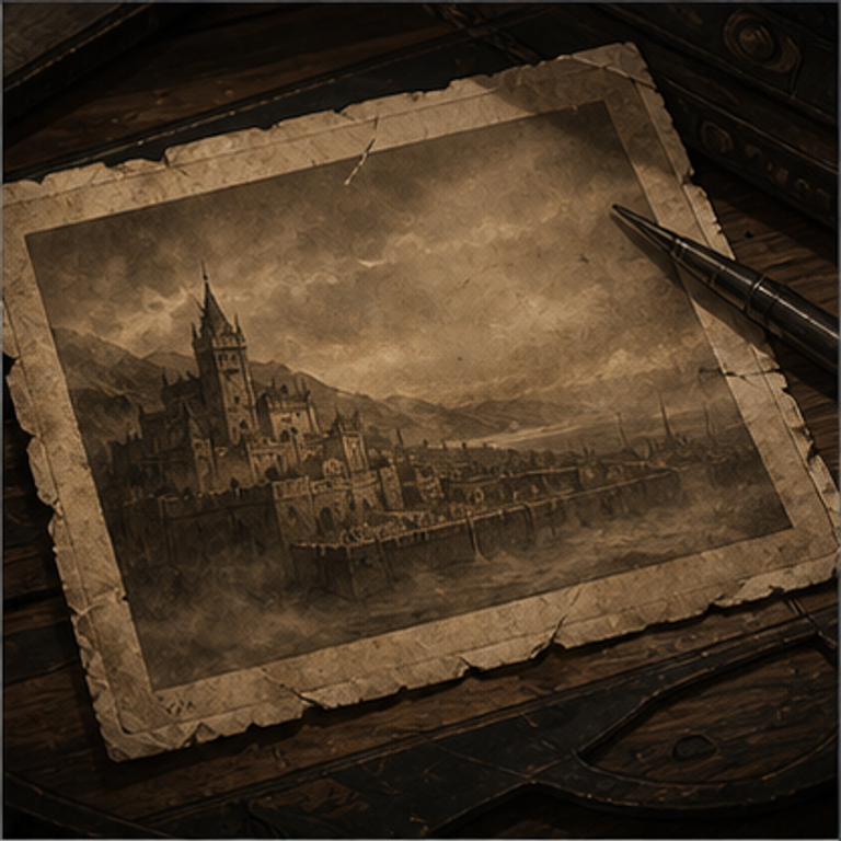
Editorial or product hero with a headline and four-card media/stat collage that expands on hover.
Basement Archive
A dramatic collage for reveals, reports, and documents that make everyone in the room go silent.
0+
Pages recovered
From the basement
Copy the file below into your project. Heronimation itself is not a runtime dependency; install or replace only the requirements listed for this variant.
"use client";

import { animate, motion, useInView, useMotionValue } from "framer-motion";
import { useEffect, useRef, useState } from "react";

// ─── CountUp ─────────────────────────────────────────────────────────────────

function CountUp({
  to,
  suffix = "",
  duration = 2,
}: {
  to: number;
  suffix?: string;
  duration?: number;
}) {
  const ref = useRef<HTMLSpanElement>(null);
  const inView = useInView(ref, { once: true, margin: "0px 0px -60px 0px" });
  const motionValue = useMotionValue(0);
  const [display, setDisplay] = useState("0");

  useEffect(() => {
    if (!inView) return;
    const controls = animate(motionValue, to, {
      duration,
      ease: [0.16, 1, 0.3, 1],
      onUpdate: (v) => setDisplay(Math.round(v).toLocaleString()),
    });
    return () => controls.stop();
  }, [inView, to, duration, motionValue]);

  return (
    <span ref={ref}>
      {display}
      {suffix}
    </span>
  );
}

// ─── Collage Grid ─────────────────────────────────────────────────────────────

const SPRING = { type: "spring" as const, stiffness: 280, damping: 22 };
const ROTATIONS = [-10, -4, 4, 9] as const;

function getCardAnimate(index: number, hovered: number | null) {
  const base = ROTATIONS[index];
  if (hovered === null) return { rotate: base, scale: 1, x: 0 };
  if (hovered === index) return { rotate: 0, scale: 1.05, x: 0 };
  return { rotate: base, scale: 1, x: index < hovered ? -28 : 28 };
}

export type CollageItem =
  | { type: "image"; src: string; alt?: string }
  | {
      type: "stat";
      value: number;
      suffix?: string;
      label: string;
      sublabel?: string;
    }
  | { type: "video"; src: string };

function CollageCard({ item }: { item: CollageItem }) {
  if (item.type === "image") {
    return (
      // eslint-disable-next-line @next/next/no-img-element
      <img
        src={item.src}
        alt={item.alt ?? ""}
        className="h-full w-full object-cover"
      />
    );
  }

  if (item.type === "video") {
    return (
      <video
        autoPlay
        loop
        muted
        playsInline
        className="h-full w-full object-cover"
      >
        <source src={item.src} type="video/mp4" />
      </video>
    );
  }

  return (
    <div className="flex h-full flex-col bg-zinc-800 p-4 md:p-6">
      <p className="text-3xl font-semibold leading-none text-white sm:text-5xl">
        <CountUp to={item.value} suffix={item.suffix} />
      </p>
      <div className="mt-auto">
        <p className="text-sm font-bold text-white">{item.label}</p>
        {item.sublabel && (
          <p className="text-xs text-zinc-400">{item.sublabel}</p>
        )}
      </div>
    </div>
  );
}

function FanGrid({
  items,
}: {
  items: [CollageItem, CollageItem, CollageItem, CollageItem];
}) {
  const [hovered, setHovered] = useState<number | null>(null);

  return (
    <div className="grid grid-cols-2 gap-4 md:grid-cols-3 lg:grid-cols-4">
      {items.map((item, i) => (
        <motion.div
          key={i}
          animate={getCardAnimate(i, hovered)}
          transition={SPRING}
          onHoverStart={() => setHovered(i)}
          onHoverEnd={() => setHovered(null)}
          className={`aspect-[3/4] ${i === 2 ? "hidden md:block" : ""} ${i === 3 ? "hidden lg:block" : ""}`}
        >
          <div className="relative h-full w-full overflow-hidden rounded-2xl">
            <CollageCard item={item} />
          </div>
        </motion.div>
      ))}
    </div>
  );
}

// ─── Component ───────────────────────────────────────────────────────────────

export interface CollageHeroProps {
  title: string;
  label?: string;
  description?: string;
  primaryButton?: { text: string; href: string };
  secondaryButton?: { text: string; href: string };
  items: [CollageItem, CollageItem, CollageItem, CollageItem];
  centered?: boolean;
  theme?: "light" | "dark";
}

export default function CollageHero({
  title,
  label,
  description,
  primaryButton,
  secondaryButton,
  items,
  centered = false,
  theme = "dark",
}: CollageHeroProps) {
  const isDark = theme === "dark";

  return (
    <section
      className={`flex flex-col pb-16 pt-28 px-6 min-h-screen ${
        isDark ? "bg-zinc-950 text-white" : "bg-stone-50 text-zinc-900"
      }`}
    >
      {/* Text block */}
      <div
        className={`mx-auto w-full max-w-7xl flex ${centered ? "justify-center" : ""}`}
      >
        <div
          className={`w-full max-w-2xl ${centered ? "flex flex-col items-center text-center" : ""}`}
        >
          {label && (
            <motion.p
              initial={{ opacity: 0, y: 12 }}
              animate={{ opacity: 1, y: 0 }}
              transition={{ duration: 0.5 }}
              className={`mb-4 text-sm font-semibold uppercase tracking-widest ${
                isDark ? "text-zinc-400" : "text-zinc-500"
              }`}
            >
              {label}
            </motion.p>
          )}

          <motion.h1
            initial={{ opacity: 0, y: 24 }}
            animate={{ opacity: 1, y: 0 }}
            transition={{ duration: 0.6, delay: 0.1 }}
            className="mb-6 text-[clamp(2.75rem,5.5vw,5.5rem)] font-bold leading-[1.05] tracking-[-0.03em]"
          >
            {title}
          </motion.h1>

          {description && (
            <motion.p
              initial={{ opacity: 0, y: 16 }}
              animate={{ opacity: 1, y: 0 }}
              transition={{ duration: 0.6, delay: 0.2 }}
              className={`max-w-md text-base leading-relaxed ${
                isDark ? "text-zinc-400" : "text-zinc-600"
              }`}
            >
              {description}
            </motion.p>
          )}

          {(primaryButton || secondaryButton) && (
            <motion.div
              initial={{ opacity: 0, y: 12 }}
              animate={{ opacity: 1, y: 0 }}
              transition={{ duration: 0.6, delay: 0.3 }}
              className={`mt-8 flex flex-col gap-3 sm:flex-row ${centered ? "justify-center" : ""}`}
            >
              {primaryButton && (
                <a
                  href={primaryButton.href}
                  className={`inline-flex items-center justify-center rounded-full px-7 py-3.5 text-sm font-semibold transition-opacity hover:opacity-80 ${
                    isDark ? "bg-white text-zinc-900" : "bg-zinc-900 text-white"
                  }`}
                >
                  {primaryButton.text}
                </a>
              )}
              {secondaryButton && (
                <a
                  href={secondaryButton.href}
                  className={`inline-flex items-center justify-center rounded-full border px-7 py-3.5 text-sm font-semibold transition-colors hover:opacity-60 ${
                    isDark
                      ? "border-zinc-700 text-zinc-300"
                      : "border-zinc-300 text-zinc-700"
                  }`}
                >
                  {secondaryButton.text}
                </a>
              )}
            </motion.div>
          )}
        </div>
      </div>

      {/* Collage */}
      <motion.div
        initial={{ opacity: 0, y: 30 }}
        animate={{ opacity: 1, y: 0 }}
        transition={{ duration: 0.7, delay: 0.25 }}
        className="mx-auto w-full max-w-7xl py-16"
      >
        <FanGrid items={items} />
      </motion.div>
    </section>
  );
}
Client component support for the copied TSX file.
Styling is expressed with Tailwind utility classes.
Used for entrance, hover, scroll, or looping animation.
Replace the demo image paths with assets from your own project.
| Prop | Type | Required | Default | Description |
|---|---|---|---|---|
| title | string | Yes | — | Main headline |
| label | string | No | — | Small eyebrow text above the title |
| description | string | No | — | Body copy below the title |
| primaryButton | { text: string; href: string } | No | — | Primary CTA button |
| secondaryButton | { text: string; href: string } | No | — | Secondary CTA button |
| items | [CollageItem, CollageItem, CollageItem, CollageItem] | Yes | — | Exactly 4 items — each is { type: "image"; src; alt? }, { type: "stat"; value; suffix?; label; sublabel? }, or { type: "video"; src } |
| centered | boolean | No | false | Center the text block |
| theme | "light" | "dark" | No | "dark" | Color theme |